
Color Palettes That Hold the Day Together
Color themes shape how a wedding is perceived long before details are noticed. They influence the room, the light, and the way people move through the day. Guests rarely name the palette, yet they react to it. A clear color concept brings order to many small decisions and helps different elements sit well next to each other. When handled with restraint, color does not lead the celebration. It supports it.
This is why the subject belongs naturally to both Color Themes and Wedding Symbolism and Meaning. Loving Rocks describes color as something that quietly structures the day, while wedding symbolism is explained there as the use of repeated forms and recognizable elements that make meaning stable enough to be felt and shared. A wedding palette often works in exactly that way. It repeats softly across paper, flowers, fabric, light, and objects until coherence starts to feel almost inevitable.
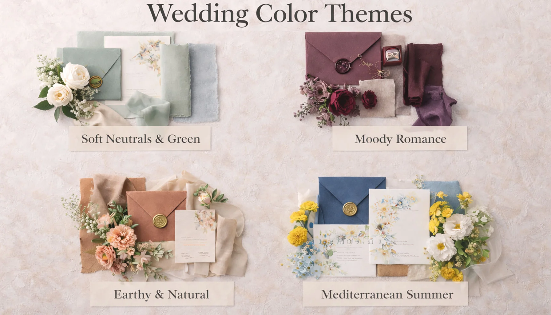
Color ThemesThe choice of colors sets the tone for the entire wedding celebration. A thoughtfully selected palette connects décor, flowers, stationery, and styling into a cohesive visual story. Whether soft and romantic or bold and modern, the right color combinations create harmony and give the wedding a clear and memorable identity.

Wedding symbolism exists to say what words cannot. Rituals, objects, and gestures carry meanings that help love survive visibility, expectation, and time.
Definition
A wedding color palette is not only a decorative preference. It is a system of visual repetition that affects atmosphere, proportion, and emotional tone across the celebration. Its strongest effect is often indirect. It helps the wedding feel stable, legible, and internally connected without demanding explicit attention.
Colors Work Through Light and Material First
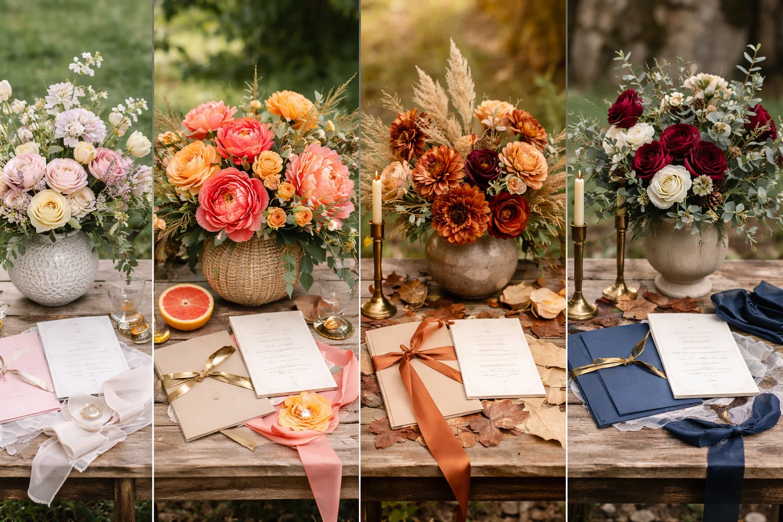
Colors never appear alone. They change under daylight, evening light, candlelight, weather, and the surfaces around them. Walls, floors, wood, stone, linen, glass, and skin tones all alter how a palette is received. This is why successful wedding colors usually respond to what is already present rather than trying to override it. The calmest palettes tend to feel discovered in the space, not imposed on it.
Restraint Gives Color Its Holding Power
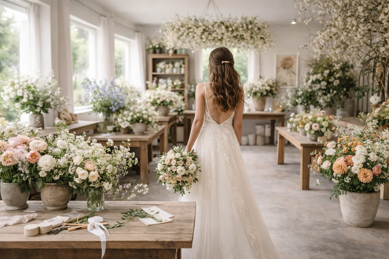
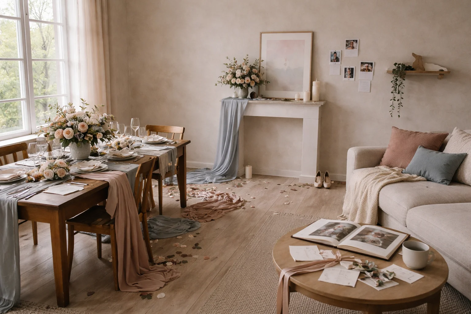
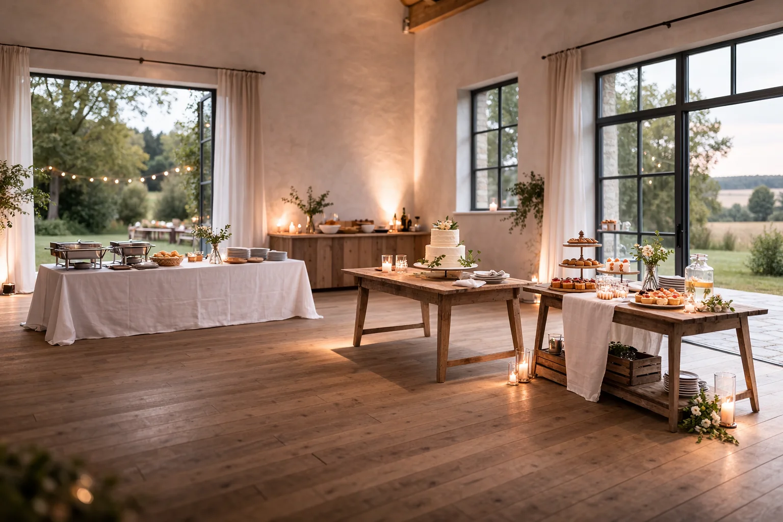
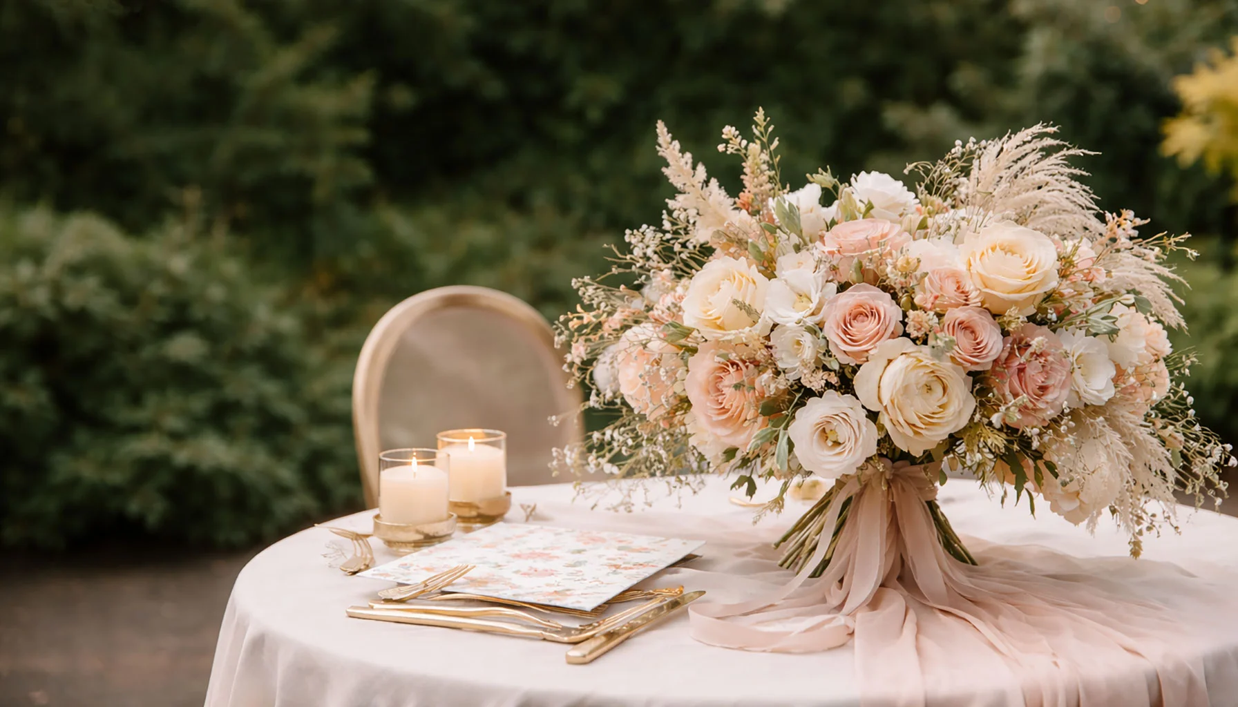
One main tone with a small range of supporting colors often feels stronger than a palette trying to prove its richness. Soft neutrals with one accent, champagne and cream, dusty blue and warm grey, terracotta and olive, linen and natural white, forest green with beige, plum with neutrals, blush with soft peach, smoky pastels, or monochrome variations all tend to work for the same reason. They leave enough room for the rest of the wedding to breathe.
Color Quietly Carries Emotional Tone
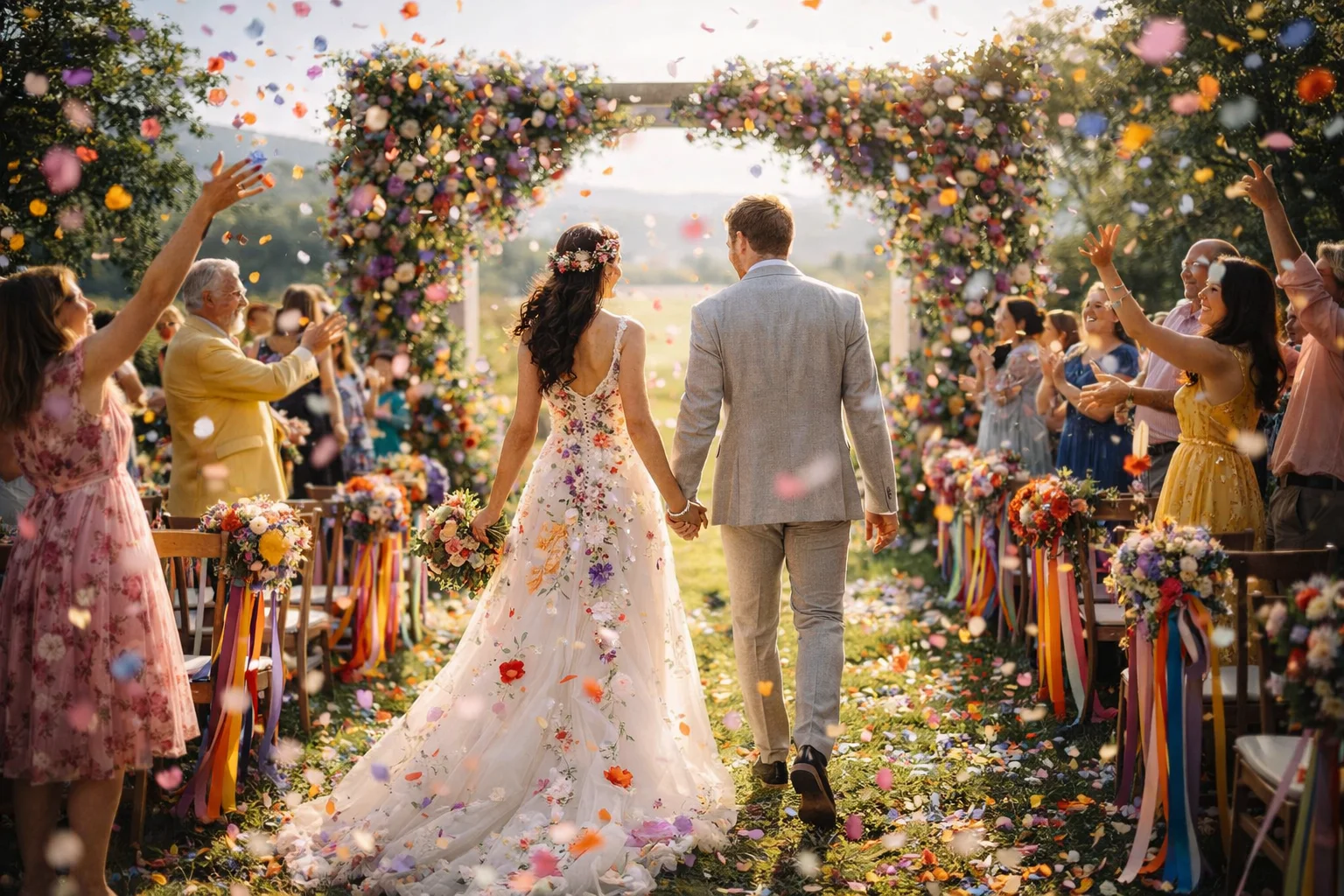
Warm colors are often experienced as open and close. Cooler tones tend to slow the room down. Deeper shades can make an evening feel more contained, while lighter palettes often widen a daytime celebration. Most weddings benefit from a mix rather than one pure direction, because weddings themselves move between openness, intimacy, ceremony, conversation, and release. Color helps those shifts feel continuous rather than abrupt.
Palettes Become Symbolic Through Repetition
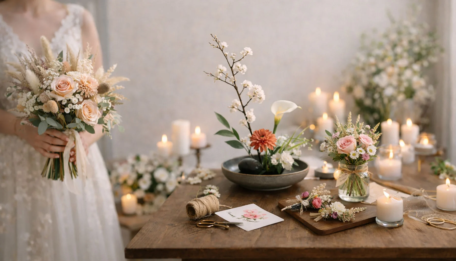
Wedding symbolism matters because repeated forms make invisible meaning easier to hold. Color can do similar work. When a palette returns in stationery, florals, candles, table details, clothing accents, guest contributions, and lighting, it creates a visual memory line across the day. Guests may not consciously register the repetition, but they feel the stability it produces. In that sense, color becomes one of the quiet symbols of the wedding itself.
Guests Read the Atmosphere, Not the Palette Name
Guests rarely talk about color directly. They respond to how the room feels. A settled palette reduces distraction, softens friction between design elements, and makes the day appear more intentional without becoming rigid. Loose dress guidance, shared elements in matching tones, flowers or paper details offered in the same range, and a few consistent choices across the wedding often create the strongest sense of coherence because they invite participation without forcing uniformity.
Conclusion
A color palette does not define a wedding, but it often holds the day together. It supports decisions, calms transitions, and allows different elements to coexist without visible strain. When color is chosen with attention and used with restraint, it creates an atmosphere that feels consistent and easy. What remains afterward is rarely the palette name itself. It is the sense that everything belonged where it was.
Related Articles
Seasonal Wedding Colors in Practice
Color at weddings often moves with the season. Not strictly planned that way. It just happens when looking across many events over time. A wedding in May rarely looks the same as one in October. The difference sits quietly in the palette.
Timeless Blooms & Modern Floral Ideas for Meaningful Wedding Celebrations
Floral design shapes the atmosphere of a wedding more through presence than through display. Small choices, careful timing, and attention to place define how flowers are perceived. When arranged with restraint, they support moments, soften transitions, and remain quietly memorable.
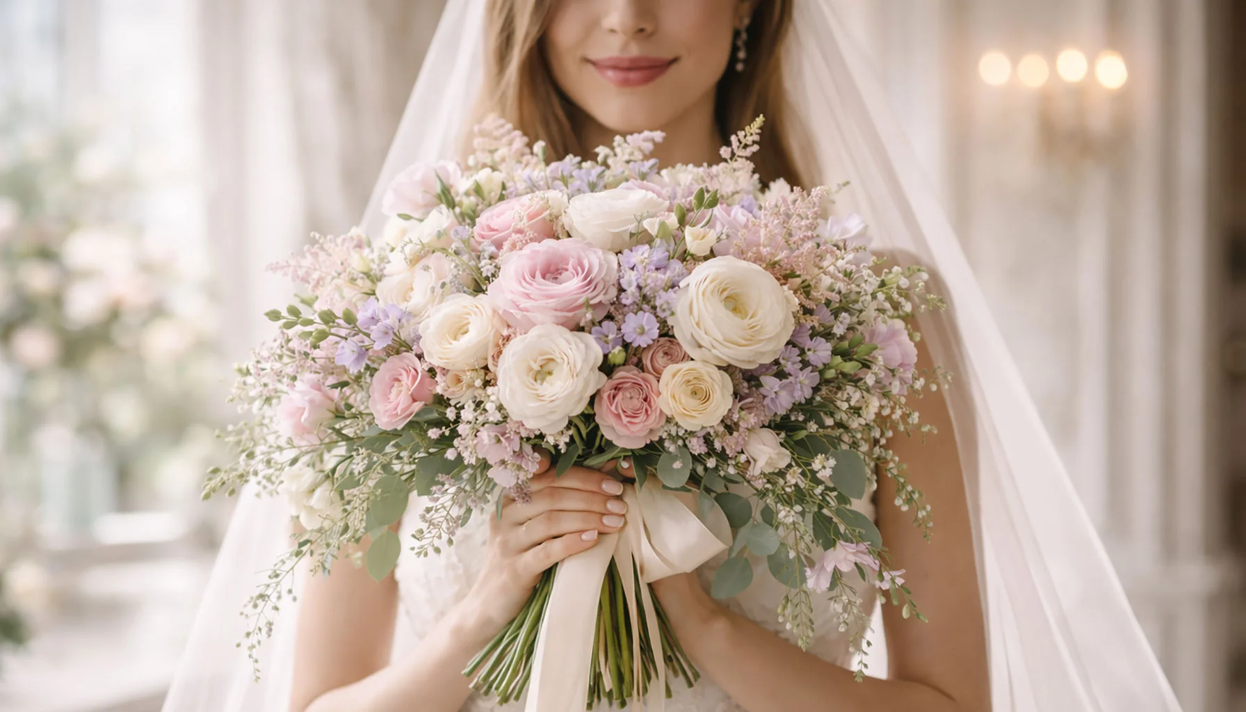
The Bridal Bouquet: A Silent Expression of Love, Style, and Timeless Emotion
The bridal bouquet accompanies the bride throughout the wedding day. It is held, adjusted, set aside, and taken up again. Its impact comes from balance rather than attention. Shape, weight, and color align with movement and appearance and become part of what is remembered.
What Flower Shops Really Shape at Weddings
Wedding flowers are often reduced to color palettes and arrangements, but flower shops influence something deeper. They define how a ceremony feels, how space breathes, and what lingers after the moment has passed. This article looks at how florists shape both the visible and the emotional layer of a wedding.
What Wedding Colors Become Once the Day Is Over
Wedding colors are often chosen early, sometimes even before the location is final. Palettes are built, combinations tested, fabrics compared. It feels like a visual decision, one that belongs entirely to the day itself.
Flowers Near Food at Weddings: Buffet and Dessert Table Placement
Flowers sometimes end up close to food. Not always by clear decision. More because the rest of the room is already filled, and these zones remain. Then something gets added there too. It does not look unusual once it is in place.
What Wedding Colors Leave Behind
Wedding colors are usually chosen for beauty, balance, or season. But they also leave a trace. Long after flowers fade and fabrics are packed away, certain tones remain attached to a promise, a room, a feeling. This article looks at wedding color not only as styling, but as part of the emotional imprint a ceremony leaves behind.
Bloom by Design: Flowers and Florals for a Modern Perfect Wedding
Flowers rarely carry a wedding by themselves. What they do, when chosen well, is quieter and often more lasting. They soften transitions, give rhythm to rooms, and help guests feel oriented without ever being told where to look. This article looks at wedding flowers through atmosphere, restraint, and the silent structure they create across the day.
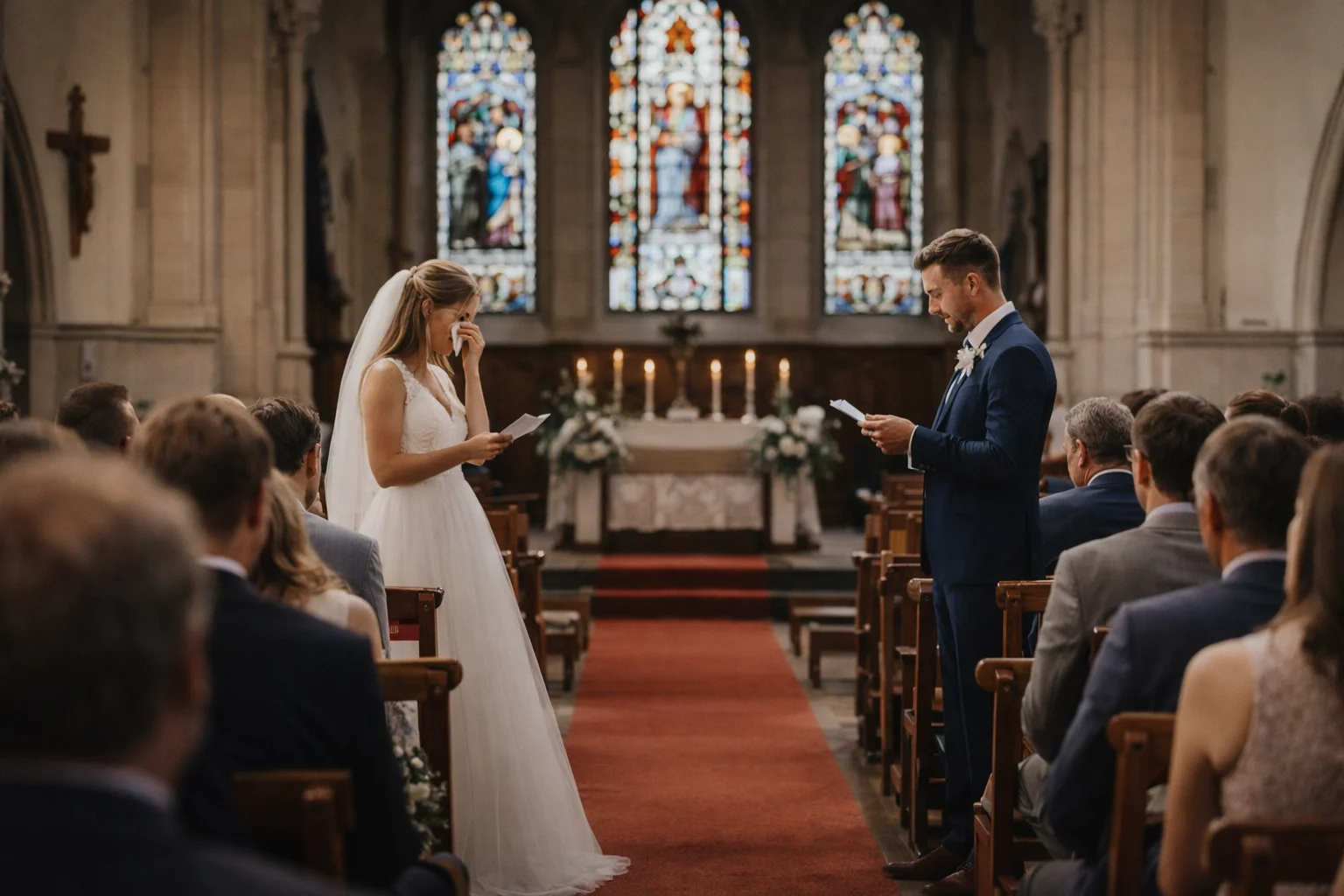
What Wedding Guests Actually Hear When Vows Are Spoken
Wedding vows are rarely received exactly as they are written. Guests hear emotion, rhythm, hesitation, clarity, imbalance, and the symbolic weight of what is being said aloud. This article looks at how vows sound in the room, what happens when the voice breaks, why shorter vows often feel stronger, and how spoken vows become more than text.