
Choose the Venue or the Wedding Colors First? A Decision Method
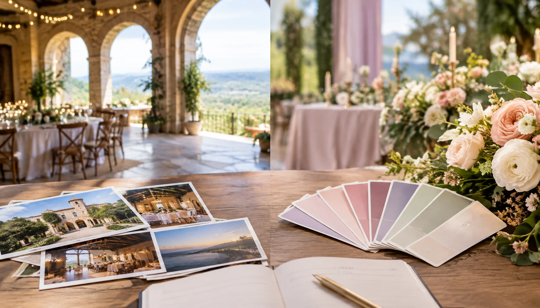
Couples often treat the venue and the color palette as two separate early decisions: one practical, one aesthetic. In reality, they are linked. A venue already contains color before you add a single flower — stone, timber, carpet, walls, metal finishes, greenery, water, sky, artificial light and whatever the room looks like after sunset. Choosing a palette before those fixed elements are known is not wrong, but it means you are designing against an environment you have not seen yet.
Why the venue is already part of your color palette
A mood board starts with colors you selected. A venue starts with colors you inherit. That difference is easy to underestimate because couples usually photograph a venue as a place — not as a set of fixed visual surfaces.
Look at a reception room as a designer would: floor, wall color, ceiling, exposed beams, stone, upholstery, curtains, chairs, permanent lighting, garden planting, water, skyline and any architectural feature that will appear repeatedly in photographs. These elements occupy much more visual space than a ribbon sample or invitation swatch.
That does not mean your colors need to “match” the venue in a literal way. Contrast can be beautiful. The important question is whether the relationship is intentional. A cool editorial palette in a warm historic room can work brilliantly when the contrast is designed; it can look accidental when the warm surfaces were simply ignored.
The Venue–Palette Dependency Test
Instead of asking which decision is traditionally made first, ask which one carries the stronger constraints for your wedding.
Which choice should constrain the other?
| Factor | If the venue dominates | If the palette dominates | |
|---|---|---|---|
| Meaning | |||
| Availability | |||
| Investment | |||
| Visual control | |||
| Wedding identity |
Choose the venue first when the palette is still flexible
Venue-first planning is usually the lower-risk path because the venue affects far more than color. It determines capacity, accessibility, travel, ceremony logistics, weather exposure, noise rules, catering options, timing and the practical shape of the day. Once that decision is made, color becomes a design response to something real.
This also gives your florist, stationer, stylist and photographer better information. “Soft green and cream” means something very different inside a glass conservatory, against dark oak, beside pale limestone, or in a ballroom with burgundy carpet. The venue turns an abstract palette into a real visual system.
The Knot's current color-planning guidance describes wedding colors as an early style decision that influences later aesthetic choices. That is useful, but the palette still benefits from being tested against the actual room rather than chosen only from digital inspiration.
Choose the colors first when they are part of the meaning, not just the styling
There are weddings where the palette should lead. If color carries cultural significance, connects two family traditions, is built around heirloom textiles, defines custom attire, or is central to an artistic concept, then asking the colors to surrender to the venue may reverse the real priority.
In that case, use the palette as a venue filter. You are not looking for a room that already contains the same colors. You are looking for a setting that gives those colors enough space to work — visually, photographically and practically.
A neutral gallery, pale stone courtyard, modern white space, garden or restrained industrial venue may provide more freedom than a highly decorated ballroom. The right venue is then the one that supports the concept rather than competes with it.
Do not judge the palette in daylight only
A venue can effectively have two or three different palettes during the same wedding. Daylight, golden hour, interior lamps, candles, colored uplighting and mixed artificial light all change how surfaces and fabrics appear.
This is not simply subjective. In photography, different light sources have different color temperatures. Adobe's white-balance guidance explains that overcast daylight can appear cooler, incandescent light warmer and some fluorescent light greener; white balance affects all colors in the frame, not only white.
That matters because your wedding palette will be experienced twice: first by the eye and later through photographs. A combination that feels subtle in bright daylight can become much warmer under evening lighting. A cool white can read cream. Pale blue can become grey. Warm neutrals can deepen dramatically.
The venue audit: what to record before finalizing the colors
A practical venue-to-palette audit
The fixed-color inventory
| Venue element | Why it matters | Typical response |
|---|---|---|
| Floor / carpet | Appears in wide photographs and may carry a strong undertone | Coordinate, intentionally contrast, or visually reduce it |
| Walls / stone / timber | Creates the largest background field | Use it as a neutral, temperature reference or contrast surface |
| Chairs / permanent furniture | Repeats across the room | Either integrate the finish or replace/cover if budget allows |
| Curtains / drapes | Can cast a strong color field behind tables or ceremony areas | Test the palette directly against them |
| Metal finishes | Gold, silver, black steel, brass or chrome influence the visual temperature | Choose supporting metallics rather than adding a competing one |
| Permanent light | Changes apparent color and skin tone in photographs | Coordinate with the lighting plan and photographer |
| Landscape / water / sky | Dominates outdoor imagery | Treat the setting as part of the palette rather than empty background |
Do not make the venue match the mood board at any cost
Once couples fall in love with a palette, it is easy to start treating the venue as a problem that needs to be covered. That can turn a beautiful place into an expensive neutral box.
Before paying to drape walls, replace every chair, disguise a floor or flood the room with colored light, ask whether the original venue was chosen because you actually liked it. If the palette requires erasing the place, either the palette or the venue may be wrong for the wedding.
A better design usually makes the existing room do some of the work. Stone can become the neutral. Garden green can become the background. Warm timber can carry the earth tones. Black steel can provide contrast. The goal is not compliance with a mood board; it is coherence.
When contrast is better than matching
Matching every undertone can make a wedding visually flat. Contrast creates hierarchy. A warm stone venue can support cool blue accents precisely because the colors are different. Dark wood can make pale flowers feel lighter. A white gallery can make saturated color look intentional rather than loud.
The test is whether one element looks accidental. Intentional contrast usually repeats somewhere else: in stationery, flowers, candle color, attire details or tableware. One isolated clashing tone looks like a mistake; a repeated contrast becomes a design language.
Photography changes what “works” means
A wedding palette does not need to reproduce itself perfectly in every photograph. Photographers intentionally use white balance, exposure and editing to create a consistent visual story. But the source conditions still matter: mixed lighting, strong color casts and highly reflective surfaces can change how fabrics, flowers and skin tones are recorded.
Adobe's photography guidance emphasizes that white balance influences all colors and that different sources can introduce warm, cool, green or magenta casts. This is one reason to involve the photographer before the palette is completely locked when the venue has unusual or heavily mixed lighting.
The practical goal is not “pick colors that cameras like.” Modern photographers can handle an enormous range. The goal is to avoid discovering too late that the room, the lighting and the palette create a color relationship you never intended.
A decision matrix for real couples
| Situation | Start with | Why |
|---|---|---|
| You have no venue and only broad color preferences | Venue | The harder constraint should come first |
| You already booked a visually strong venue | Venue | Its fixed palette is now part of the design system |
| Your palette has cultural or family meaning | Palette | The colors are part of the wedding's meaning, not an accessory |
| Custom attire is already commissioned | Palette / attire | The room should support what cannot reasonably be changed |
| You want a highly transformable editorial design | Either, but choose a neutral/controllable venue | The design concept needs visual freedom |
| The dream venue has a difficult carpet or strong wall color | Venue + deliberate adaptation | Do not abandon it automatically; test whether the fixed element can become background rather than enemy |
| You love a trend color but have not chosen anything else | Venue first | Trend preference is usually easier to adjust than the major logistical commitment |
What would change this answer?
The venue-first recommendation changes when the palette has a stronger constraint than the venue. Cultural symbolism, custom attire, inherited textiles, religious meaning, a very specific artistic concept or already-contracted design work can all make color the harder-to-change decision.
It also changes when the venue is unusually neutral or transformable. A white studio, clean marquee, minimal gallery or blank outdoor setting may place very little pressure on the palette. In those cases, choosing the color story early can help create the venue rather than respond to it.
Finally, it changes with budget. A couple with substantial production resources can alter lighting, furniture, draping, flooring and florals to a degree that makes the original room less visually dominant. The more fixed elements you can actually change, the weaker the venue's palette constraint becomes.
Limitations
Color perception is personal, cultural and context-dependent. There is no objective rule saying that a palette must harmonize with a venue, that warm and cool tones cannot mix, or that certain wedding colors are universally more flattering.
Photography also varies by camera, lighting technique, white-balance decisions and editing style. The purpose of testing the palette in the venue is therefore not to predict every finished photograph; it is to remove avoidable surprises.
Conclusion
If both decisions are still open, book the place you genuinely want to marry in and let the palette become a response to that place. The venue is not an empty container waiting for color. It already has one.
But if your colors carry meaning that matters more than the room, reverse the process and choose a setting that gives them space. The useful rule is not “venue first” or “colors first.” It is: let the harder-to-change, more meaningful decision constrain the easier one.
FAQ
Venue or wedding colors first?
Should we choose our wedding venue or wedding colors first?
Can we choose wedding colors before booking the venue?
Do wedding colors need to match the venue?
Why should we test wedding colors at the venue?
What if the venue has an ugly carpet or strong wall color?
Glossary
Key planning terms
- Fixed color
- A visually significant color already present in the venue that is difficult or expensive to change, such as flooring, stone, timber, walls or permanent furniture.
- Color temperature
- A way of describing the warm or cool character of a light source, which changes how colors appear to the eye and camera.
- White balance
- A photographic adjustment used to render colors appropriately under different light sources; it affects the appearance of all colors in an image.
- Palette role
- The function a color serves in the overall design, such as dominant, supporting, neutral, accent or metallic.
- Venue–Palette Dependency Test
- A planning method that decides whether the venue or the palette should come first by comparing meaning, availability, investment, visual control and wedding identity.
Sources and further reading
The Knot — How to Pick Wedding Colors With Intention and CareCurrent wedding-planning guidance on choosing colors as an early design decision and using them consistently across the celebration.
Adobe — Adjusting White Balance Settings to Improve PhotosPhotography guidance explaining how different lighting situations create different color temperatures and affect all colors in an image.
Adobe — Understand White BalanceAn accessible explanation of color temperature, white balance and how lighting changes the recorded appearance of colors.
The Knot — Wedding Uplighting GuidePlanning guidance on using venue lighting to influence ambience, architecture and the visible color environment.
Related Articles
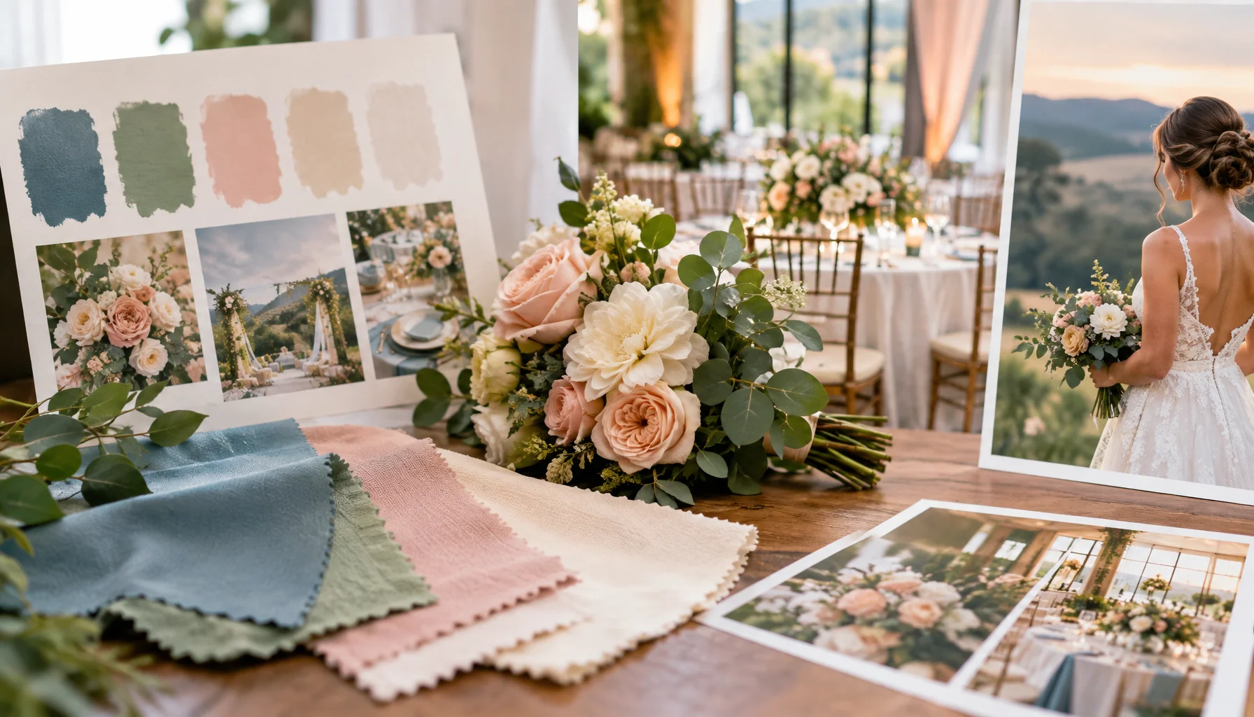
Will Your Wedding Colors Actually Photograph the Way You Imagine?
Wedding colors do not travel unchanged from a mood board to fabric, flowers, venue lighting and finished photographs. This guide explains why colors shift and gives couples a practical way to test whether their palette will remain recognizably itself throughout the day.
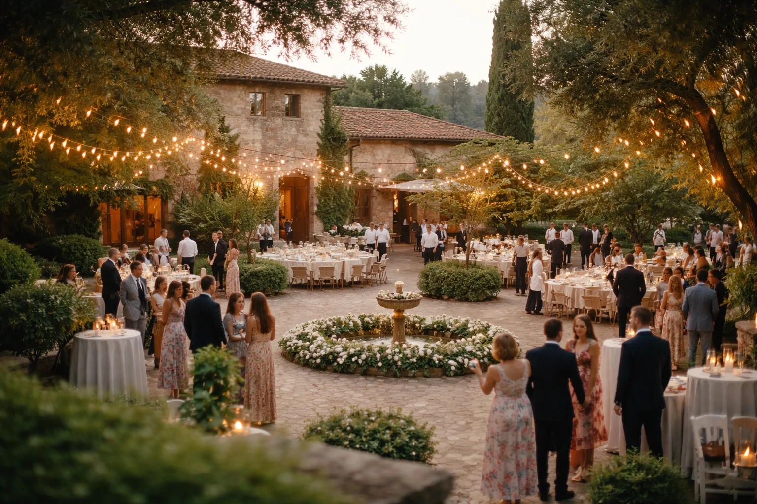
Location vs Expectation: How Wedding Spaces Actually Feel on the Day
A location is usually known before the day. Seen in photos, maybe visited once, talked through. It already exists in a certain way. Then the wedding happens inside it. People arrive, move, wait. The space stays the same, but it starts to read differently.
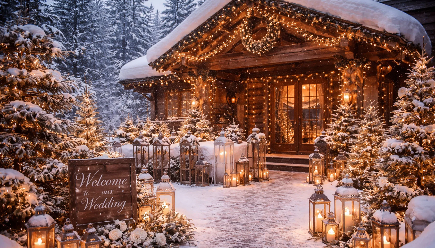
Winter Weddings: Beautiful Locations, Planning Tips and Ideas
Winter weddings move by a different clock. Light shortens, rooms gather people more closely, and warmth becomes part of the structure of the day. This article looks at winter weddings not only as a seasonal style, but as a form of celebration shaped by atmosphere, containment, and the emotional trace a winter setting leaves behind.
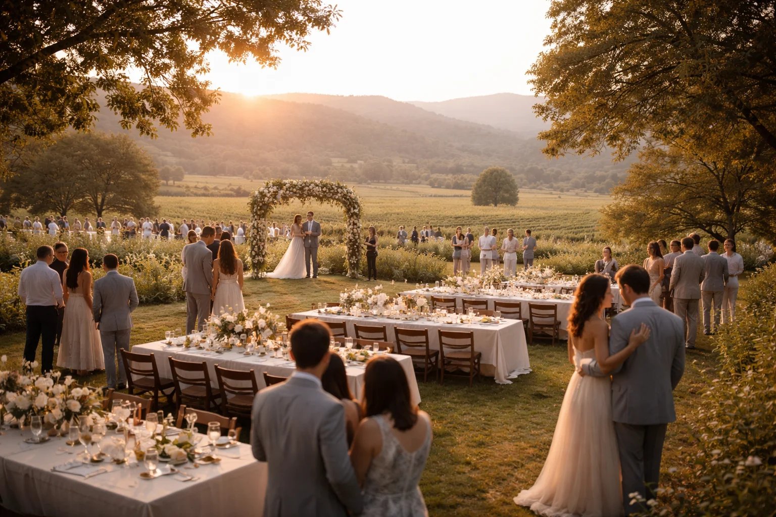
Light and Time at Weddings: How Daylight Subtly Shifts Flow and Perception
Daylight changes more than the look of a wedding. It shifts pacing, delays transitions, draws guests toward or away from certain spaces, and leaves behind some of the strongest visual impressions of the day.
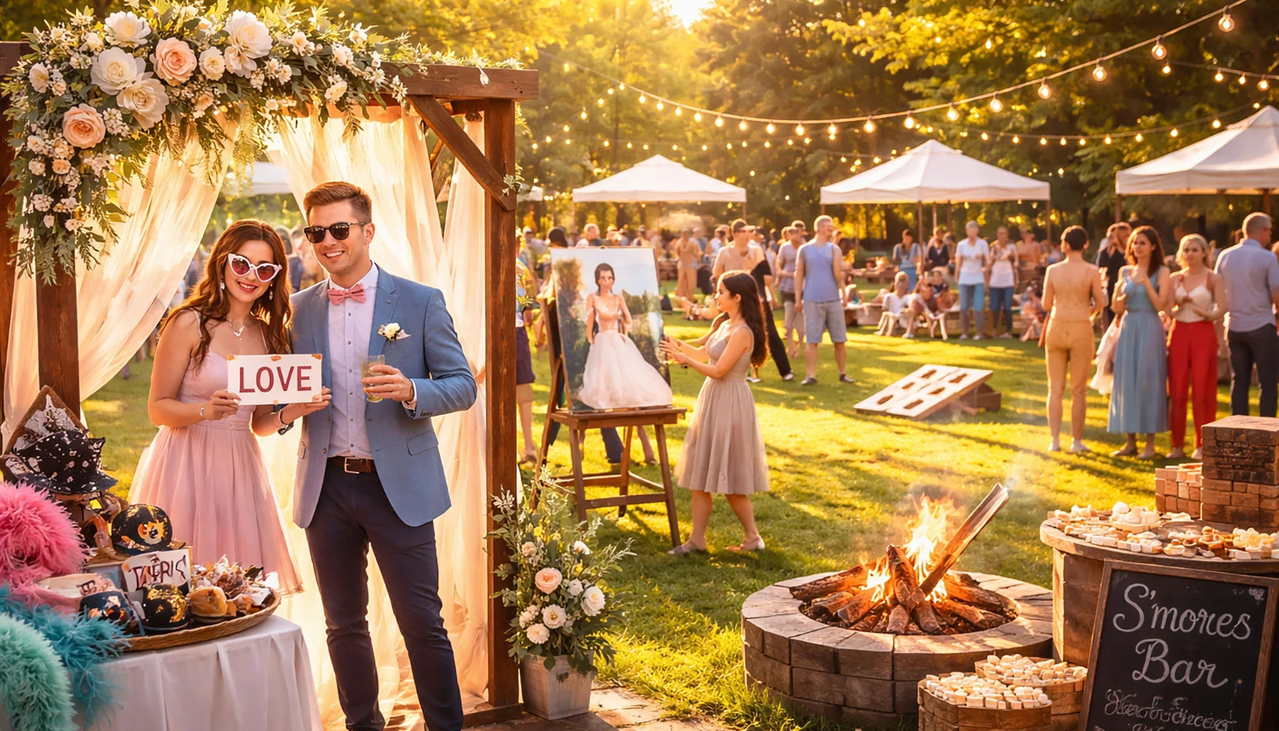
Wedding Guest Activities That Create Lasting Memories
The wedding activities guests remember most are rarely the loudest. They are the ones that give people something gentle to enter, something quiet to touch, and something small to carry away afterward. This article looks at which kinds of wedding guest activities tend to stay with people and why they often leave a deeper imprint than more spectacular entertainment.
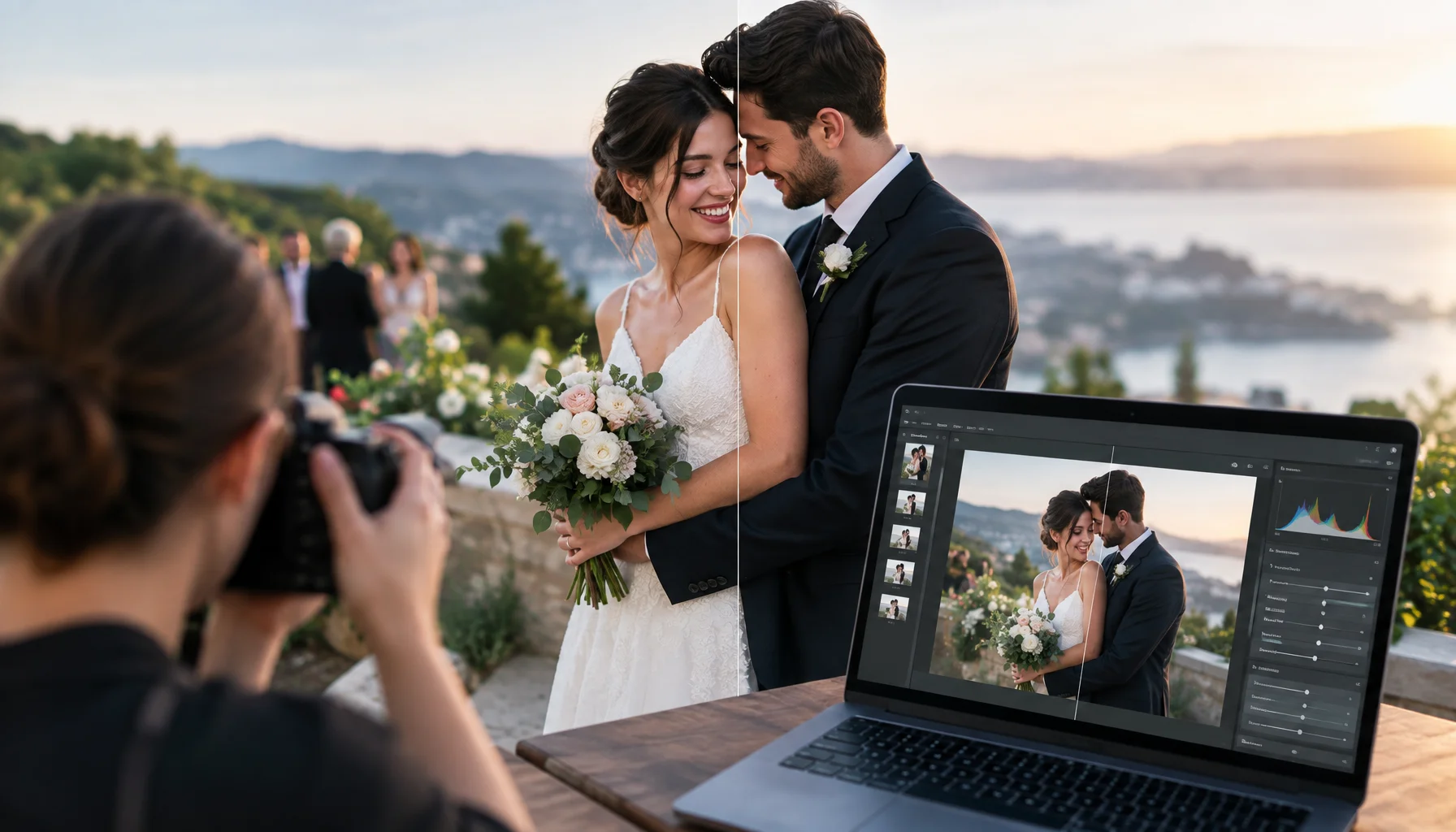
AI-Edited Wedding Photos in 2026: Where Should the Documentary Boundary Be?
Generative AI can now remove people, reconstruct missing details, replace backgrounds and create wedding images that look completely photographic. This guide helps couples decide which edits are normal photography, which cross into factual alteration, and what to agree with the photographer before the wedding.
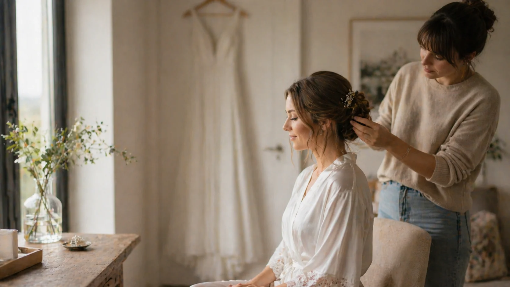
Bridal Getting-Ready Room Checklist: Light, Surfaces, Noise, and Movement
A bridal getting-ready room does more than hold hair, makeup, and dresses. This article looks at light, surfaces, noise, movement, privacy, and the quiet traces the room leaves on the morning before the ceremony.
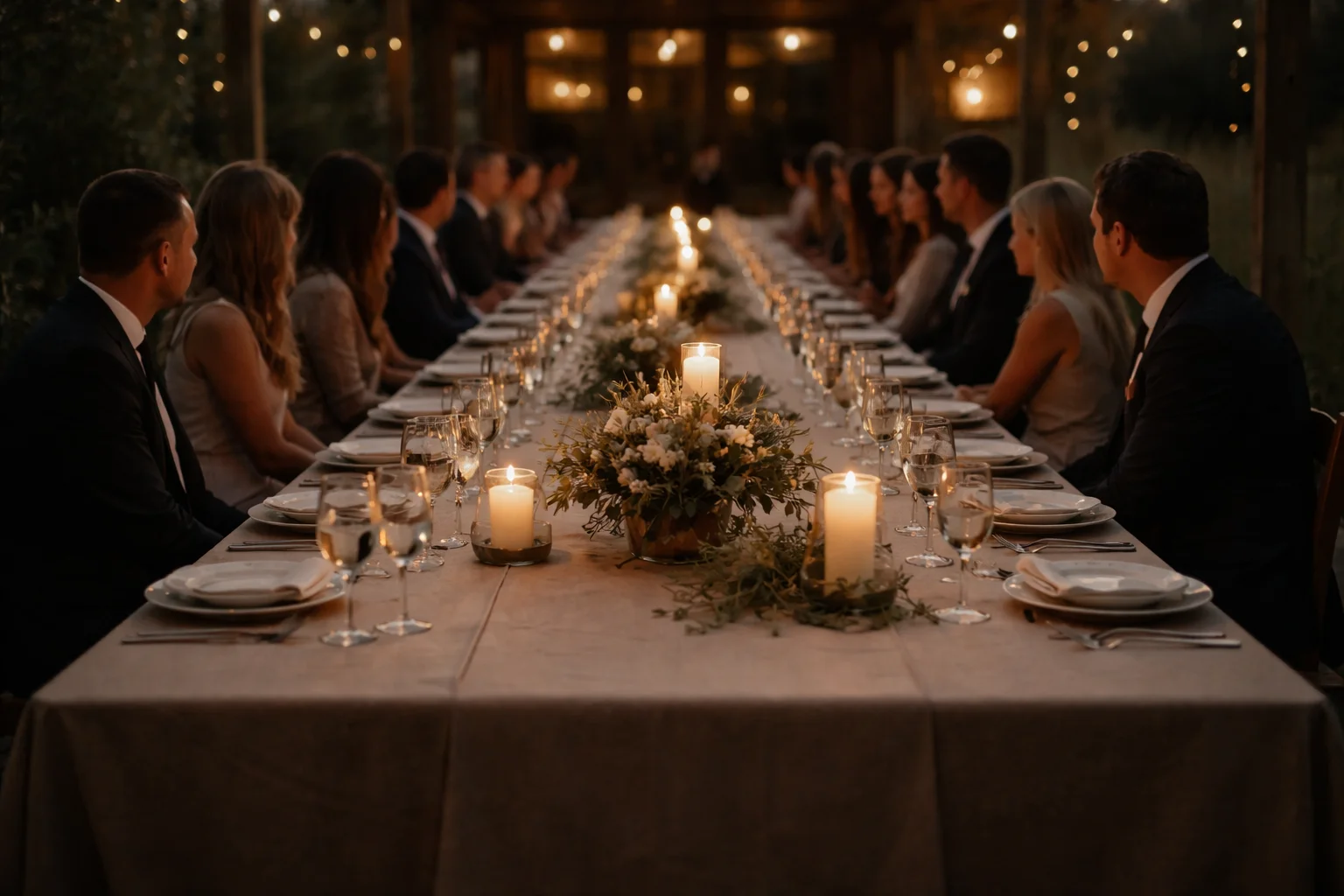
Candlelight at Wedding Tables: Local Light Zones
Candlelight at wedding tables rarely behaves as one smooth glow. It gathers in small zones, shifts across faces and objects, and leaves behind a more fragmentary, memorable atmosphere than even lighting ever could.
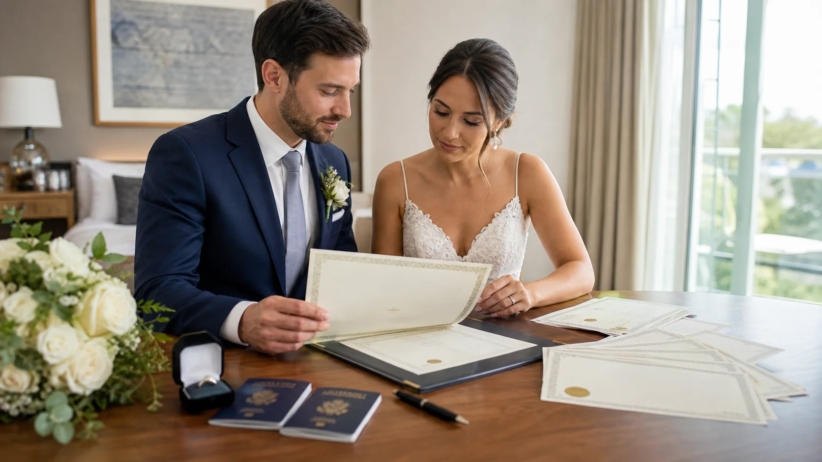
Marriage Certificate Checklist: Why One Document Keeps Returning After the Wedding
A marriage certificate often feels like the final paper of the wedding, but it keeps returning in ordinary life. This article looks at certified copies, scans, translations, apostilles, name changes, travel, banking, insurance, and the quiet imprint one document leaves after the celebration.
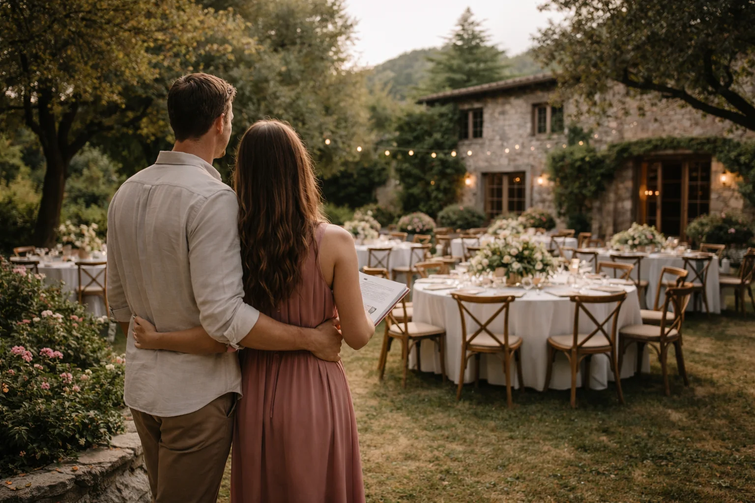
What Couples Notice Too Late About a Wedding Venue
Wedding venues are often chosen in a moment of projection. Couples imagine light, atmosphere, and feeling long before they understand flow, pressure points, and what the place is actually asking of the day. This article looks at what couples often notice too late about a venue, and why expectation and reality begin separating earlier than most people think.
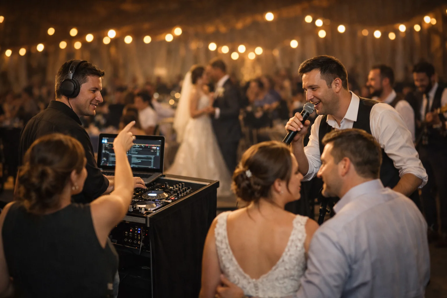
How Requests Move Through a Wedding Night
Music requests at weddings are rarely just about songs. They move through timing, confidence, mood, and the different logic of DJs and live bands, shaping the social texture of the night as much as the playlist itself.
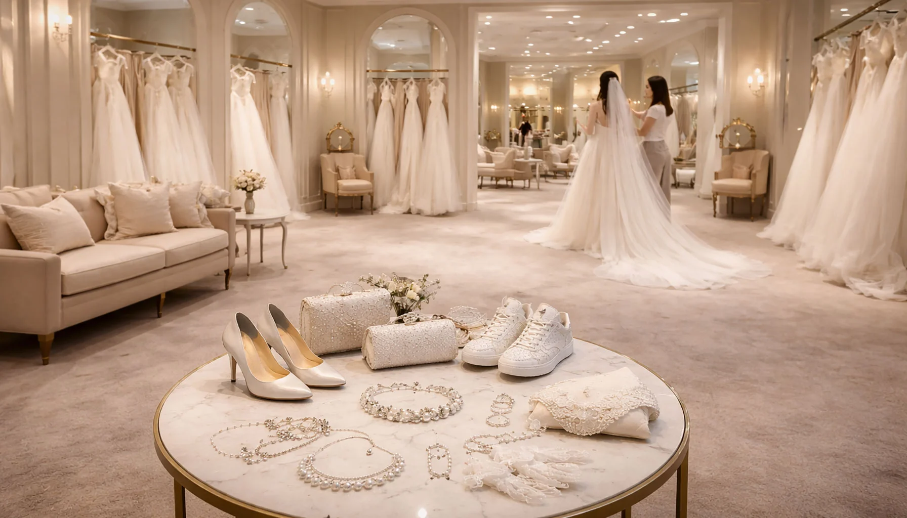
Bridal Accessories in Interplay – A Silent Addition
Accessories for the bride mostly remain in the background. They don't impose themselves and are rarely noticed first. In bridal shops, however, it repeatedly becomes apparent that precisely these pieces structure and round off the overall look. Veils, shoes, jewelry or small accessories do not change the dress, but rather the bride's effect. Observations from practice show how subtle decisions are made and why accessories are often chosen only late – and then stay.