
Will Your Wedding Colors Actually Photograph the Way You Imagine?
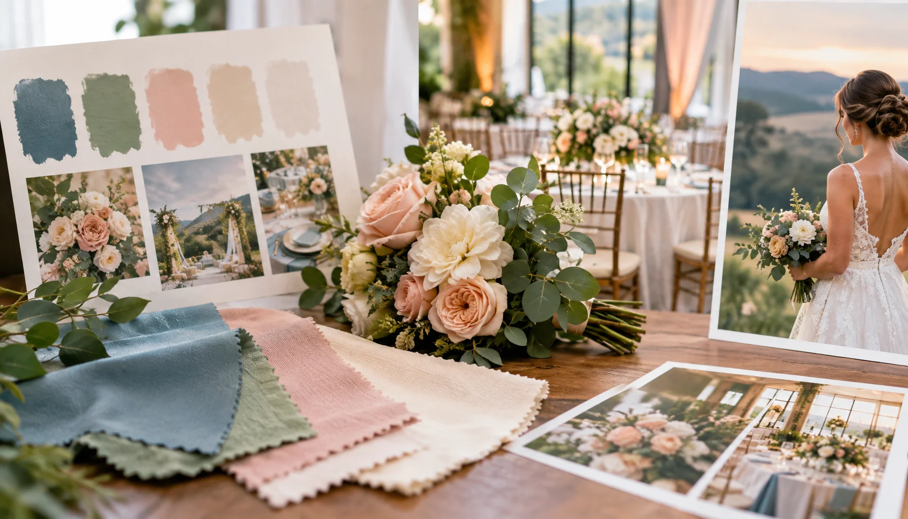
Wedding colors are usually chosen from screens, paper samples, flowers, fabric swatches, mood boards, or a combination of all five. Then the wedding day arrives and the same “color” seems to change from place to place: warmer under candles, cooler in shade, greener under mixed indoor light, flatter in a phone photo, richer in a professional edit, and different again in print. The important point is simple: a wedding color is not one fixed appearance. It is a material under a light source, seen or captured by a device.
A color swatch is only the beginning
When you save a digital swatch called dusty blue, butter yellow, sage, ivory, terracotta or burgundy, you are choosing a reference. The actual wedding color is produced by real material: dyed fabric, printed paper, petals, painted surfaces, candles, ribbon, glass, metal, skin, wood and the venue around them.
Those materials reflect light differently. Two objects can appear very close under one light and separate visibly under another. X-Rite describes this phenomenon as metamerism: colors that appear to match under one set of viewing conditions can stop matching when the illumination changes.
That is why a bridesmaid dress, linen sample and printed invitation can all be sold under the same color name and still look slightly different together. The issue is not necessarily that one supplier is wrong. The materials, dyes, print processes and reflections are different.
The Wedding Color Translation Chain
How a wedding color becomes a photograph
Light changes the palette before the camera does
The first major transformation happens before a photograph is taken. Different light sources contain different spectral energy. That changes which wavelengths are available to be reflected from a surface.
X-Rite's color guidance explains that objects can look different under different light sources because the spectrum of the illumination changes. Their metamerism examples show how two colors that appear to match under daylight can separate under fluorescent or incandescent light.
At a wedding, that means the palette can change as the day moves from outdoor ceremony to shaded portraits, indoor dinner, candlelight and evening dance floor. One palette is being translated through several lighting environments.
White balance changes every color in the frame
White balance is often misunderstood as a correction for white objects. In practice it affects the color rendering of the entire image. Adobe and Nikon both explain white balance as the camera or editing system's way of compensating for the color of the light source so that colors appear natural.
A warm room can therefore be rendered neutrally, left intentionally warm, or balanced somewhere between the two. The same pale yellow flowers may look creamy in one edit and more clearly yellow in another without either image being technically “wrong.”
This is also why comparing a venue phone photo with a photographer's finished gallery can be misleading. The phone and professional workflow may make very different white-balance, exposure and tone decisions.
Mixed lighting is where palettes become unpredictable
A single light source is relatively easy to interpret. Mixed lighting is harder. A reception room may combine daylight through windows, warm ceiling lights, colored uplighting, candles and DJ lighting.
Nikon's white-balance guidance notes that manual white-balance techniques become useful when a scene contains mixed lighting. The important wedding implication is that one global correction cannot always make every part of the room look neutral at once.
If the wedding palette relies on very subtle differences — ivory versus cool white, dusty rose versus peach, sage versus grey-green — mixed light can compress or exaggerate those differences depending on where people and objects are standing.
The same color name can hide different materials
| Material | Why the color may shift visually | Wedding example |
|---|---|---|
| Matte paper | Diffuse reflection, printing ink and paper base affect the result | Invitation, place card, menu |
| Satin / silk | Directional highlights and changing angle can make one fabric look lighter or more saturated | Dress, ribbon, table runner |
| Velvet / suede-like texture | Directional fibers change reflected light with viewing angle | Jacket, ring box, lounge furniture |
| Fresh flowers | Petal translucency, natural variation and hydration alter color | Bouquet, centerpiece |
| Painted surface | Finish and surrounding light influence perceived hue and value | Backdrop, signage, wall |
| Glass / metal | Reflection introduces colors from the room itself | Candlesticks, glassware, metallic decor |
X-Rite's technical color material explains that directional materials can even show geometric forms of metamerism: appearance changes with viewing or illumination angle. That is particularly relevant to satin, velvet, metallics and reflective wedding details.
The Palette-to-Image Test
The best way to reduce color surprises is not to predict the entire finished gallery. It is to test whether the palette keeps its intended relationships under the conditions that matter.
Test the palette before the wedding
What should stay stable when exact color cannot?
Perfect reproduction across every light, camera and display is unrealistic. A stronger design goal is to protect the relationships inside the palette.
Protect relationships, not hexadecimal values
| What matters | Useful question | Failure to watch for | |
|---|---|---|---|
| Warm / cool balance | |||
| Contrast | |||
| Light / dark hierarchy | |||
| Soft / saturated hierarchy | |||
| Proximity to skin |
Do not choose a palette from one phone screen
A phone screen is useful for collecting ideas but weak as a final color reference. Displays vary in calibration, brightness, color gamut, night modes and automatic tone adjustments. The same image can look different on two phones.
Color-management systems exist precisely because RGB values are interpreted by devices. X-Rite's color guidance distinguishes spectral characteristics of physical surfaces from device-dependent RGB and CMYK descriptions. For wedding planning, the practical lesson is not to become a color scientist; it is simply to promote physical samples above screenshots when decisions become expensive.
Flowers deserve their own tolerance
Flowers are living materials, not manufactured swatches. Natural variation, season, cultivar, maturity, hydration and local availability can all alter tone. A florist can work within a color family, but asking petals to reproduce an exact digital value is usually the wrong specification.
For flowers, describe range and role: creamy rather than stark white; muted apricot rather than orange; cool dusty pink rather than peach; deep wine as an accent rather than the dominant tone. This gives the florist room to protect the visual relationship even when exact varieties change.
The photographer's editing style is part of the final palette
Photographers do not merely document color; they interpret it. Some edit toward warm skin and soft highlights, some preserve cooler neutrals, some reduce saturation, some favor deep contrast, and some aim for a very neutral documentary look.
That means a photographer should not be judged only by whether individual images look beautiful. Review full galleries in conditions similar to your wedding: indoor reception, candlelight, cloudy ceremony, bright summer sun, dark venue. The question is whether you like what happens to the whole color environment.
A practical risk matrix for wedding colors
| Palette characteristic | Main photographic risk | Useful test |
|---|---|---|
| Very subtle neutrals | Different whites, creams and greys collapse together or shift under mixed light | Test physical samples under daylight and evening light |
| Pastels | Can lose saturation or separation in bright light | Photograph against actual venue background |
| Deep reds / burgundy | May become very dark in low exposure or warm light | Test near evening reception lighting |
| Cool blue / lavender | Can shift grey under warm or low-quality light | Compare daylight, shade and indoor capture |
| Green-heavy palette | Mixed fluorescent/LED light can complicate green casts | Test under actual fixtures and discuss with photographer |
| Metallics | Reflections can introduce surrounding colors | Evaluate in the actual room rather than isolated samples |
| Highly saturated accents | Can dominate the image more than expected | Use them in realistic proportion during testing |
What would change this answer?
The amount of testing you need changes with how color-critical the wedding concept is. If the palette is broad, organic and intentionally varied, exact shifts matter less. If the visual identity depends on several near-matching neutrals, coordinated textiles or a very specific fashion palette, physical testing matters much more.
The answer also changes with lighting control. A venue using one consistent professional lighting setup is more predictable than a room mixing window daylight, decorative LEDs, fluorescent utility light and colored DJ fixtures.
Finally, it changes with photographic intent. A couple choosing intentionally warm, cinematic or editorial photography may want the final gallery to reinterpret the palette rather than reproduce it neutrally. In that case, the photographer's style becomes part of the design decision from the beginning.
Limitations
This is a planning method, not a color-calibration workflow. Professional color measurement, camera profiling, controlled viewing and print-proofing can go much further than couples need for ordinary wedding decisions.
Different cameras, lenses, photographers and editing workflows can produce different results from the same scene. Natural flowers and fabrics also vary. The aim is therefore not exact prediction; it is identifying the combinations most likely to surprise you.
Conclusion
Wedding colors do not travel unchanged from Pinterest to fabric to ballroom to photograph. They move through a chain: material, light, reflection, camera, white balance, edit and display.
If color matters to you, test the actual relationships under the actual conditions. Use physical materials, look at them in daylight and venue light, review complete photographer galleries, and decide which parts of the palette must remain recognizable. The goal is not perfect reproduction. It is a wedding whose color story still feels like yours after the light changes.
FAQ
Wedding colors and photography
Why do wedding colors look different in photographs?
Can two wedding items be the same color but photograph differently?
Should we test wedding colors at the venue?
What is the biggest risk with mixed wedding lighting?
Should our wedding photographer reproduce the colors exactly?
Glossary
Key color and photography terms
- Metamerism
- A phenomenon in which two colors appear to match under one lighting condition but no longer match when the viewing conditions change.
- White balance
- The camera or editing adjustment used to compensate for the color of the light source so that colors are rendered in the intended way.
- Color temperature
- A way of describing the warm or cool appearance of a light source, commonly expressed in Kelvin.
- Mixed lighting
- A scene illuminated by more than one type or color of light at the same time, such as daylight plus warm lamps and colored LEDs.
- Palette-to-Image Test
- A practical wedding-planning test that checks real palette materials together under relevant lighting and photographic conditions before the wedding.
Sources and further reading
X-Rite — What Is Metamerism?Color-science explanation of why colors that match under one light can separate when the illumination changes.
X-Rite — Standard Viewing ConditionsTechnical guidance on viewing conditions and metamerism when judging color.
Adobe — Understand White BalanceExplanation of color temperature and how white balance affects every color in an image.
Nikon — Setting White BalancePhotography guidance on daylight, incandescent, fluorescent, shade and mixed-light white balance.
X-Rite — Color Guide and GlossaryTechnical explanation of physical color, spectral reflectance, device-dependent RGB/CMYK and metameric behavior.
Related Articles
Light and Time at Weddings: How Daylight Subtly Shifts Flow and Perception
Daylight changes more than the look of a wedding. It shifts pacing, delays transitions, draws guests toward or away from certain spaces, and leaves behind some of the strongest visual impressions of the day.
Bridal Getting-Ready Room Checklist: Light, Surfaces, Noise, and Movement
A bridal getting-ready room does more than hold hair, makeup, and dresses. This article looks at light, surfaces, noise, movement, privacy, and the quiet traces the room leaves on the morning before the ceremony.
Candlelight at Wedding Tables: Local Light Zones
Candlelight at wedding tables rarely behaves as one smooth glow. It gathers in small zones, shifts across faces and objects, and leaves behind a more fragmentary, memorable atmosphere than even lighting ever could.
Marriage Certificate Checklist: Why One Document Keeps Returning After the Wedding
A marriage certificate often feels like the final paper of the wedding, but it keeps returning in ordinary life. This article looks at certified copies, scans, translations, apostilles, name changes, travel, banking, insurance, and the quiet imprint one document leaves after the celebration.
The Wedding Checklist That Grounds You: Turning Planning Into Something Meaningful
A wedding checklist isn’t just about tasks—it’s about clarity, intention, and trust. Here’s how to approach it in a way that feels calm, structured, and truly yours.
Bridal Accessories in Interplay – A Silent Addition
Accessories for the bride mostly remain in the background. They don't impose themselves and are rarely noticed first. In bridal shops, however, it repeatedly becomes apparent that precisely these pieces structure and round off the overall look. Veils, shoes, jewelry or small accessories do not change the dress, but rather the bride's effect. Observations from practice show how subtle decisions are made and why accessories are often chosen only late – and then stay.
Outdoor Weddings With Children: Freedom, Boundaries, and Attention
Outdoor weddings often feel easier with children because there is more room to move, but that same openness changes how boundaries work and how attention is held. This article looks at how freedom, supervision, fatigue, and small shifting moments shape child-friendly outdoor celebrations.
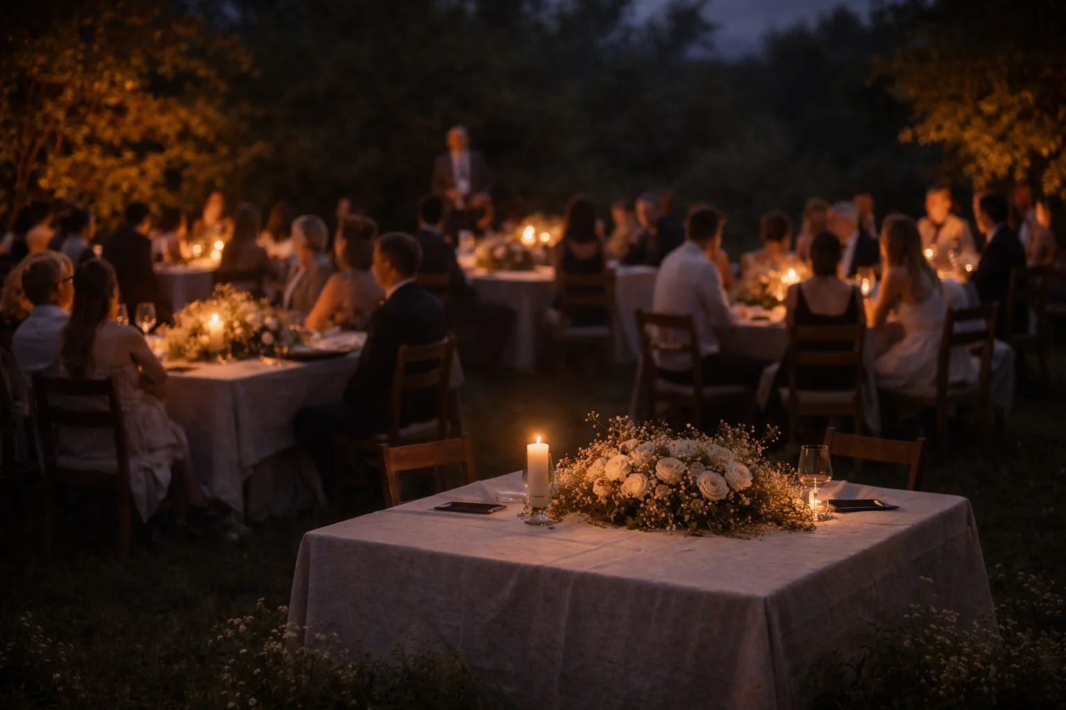
How to Make Wedding Lighting Feel Warmer and More Intentional
Lighting at weddings is often treated as a technical detail, but it defines how a space is felt before anything else is noticed. This article explores how to make light softer, calmer, and more intentional, and why what is not directly seen often matters most.
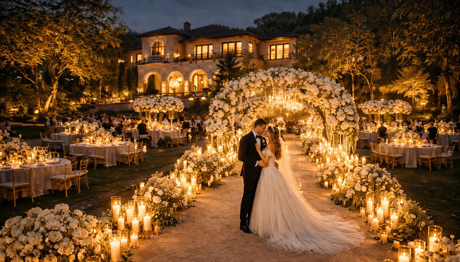
A day, carried by closeness
This wedding thrived on closeness and attention. Everything quietly intertwined and created a framework in which guests felt safe, welcome, and connected. From arrival to departure, a shared flow emerged that left room for conversations, laughter, and quiet togetherness. What remained was a feeling of warmth and cohesion that outlasted the day.
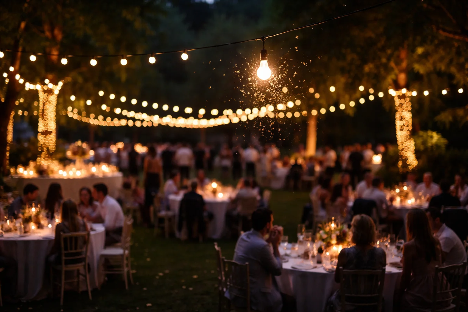
Insects Around Light Sources at Weddings
Outdoor weddings shift once the light fades. What looked calm in late afternoon starts to move differently. Lamps switch on, strings of bulbs hum a bit, faces turn toward brighter spots. And then, slowly, insects begin to show up. Not all at once. Just a few at first, easy to miss.
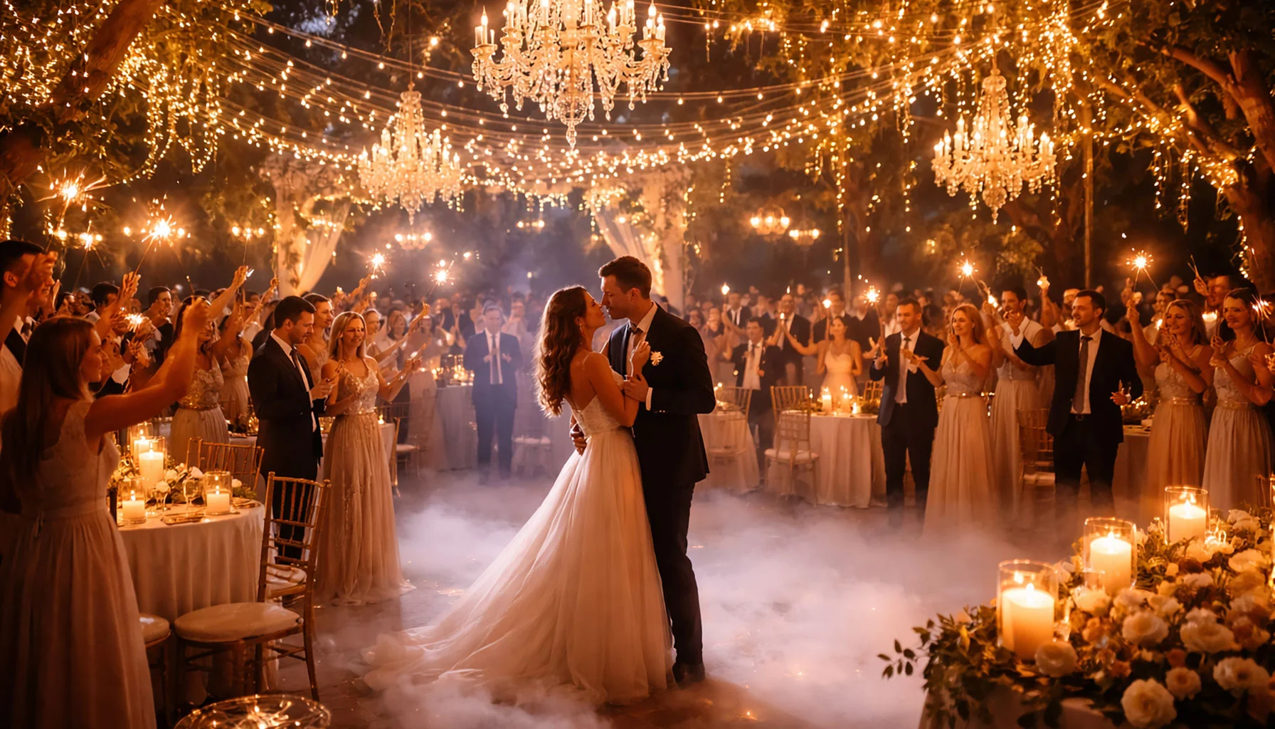
Wedding Lighting: Creating Atmosphere That Lasts
Wedding lighting is rarely remembered as equipment. What remains is how a room felt when people entered it, how the evening softened, and how different parts of the celebration seemed to belong together without visible effort. This article looks at wedding lighting as a quiet structure that shapes atmosphere and leaves a lasting imprint.
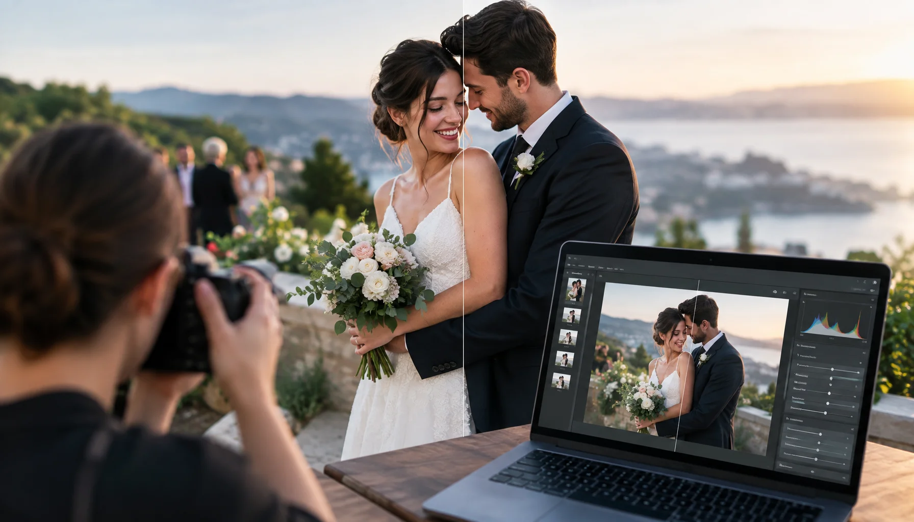
AI-Edited Wedding Photos in 2026: Where Should the Documentary Boundary Be?
Generative AI can now remove people, reconstruct missing details, replace backgrounds and create wedding images that look completely photographic. This guide helps couples decide which edits are normal photography, which cross into factual alteration, and what to agree with the photographer before the wedding.